


Format Income Statement: A Quick Guide to Master the format income statement
To get your income statement right, you need to pick a layout—either single-step or multi-step—and then organize your line items in a way that actually makes sense. For any service business, the multi-step format is hands-down the better choice. It gives you far deeper insights by calculating key metrics like gross profit and operating income, showing you what’s really driving your profitability.
Why Your Income Statement Format Matters

Staring at a generic financial report can be overwhelming. You see a sea of numbers, but you get very few real answers about how your business is actually doing. We see this all the time, but it doesn’t have to be your reality. The way you format your income statement can transform it from a simple compliance document into a strategic roadmap, especially for a service business.
A thoughtfully structured statement does more than just list revenues and expenses. It tells a story about your company’s performance, revealing the insights you need to make smarter, more confident decisions.
From Compliance Document to Strategic Tool
The main purpose of a well-formatted income statement is to provide clarity. For a service-based company, that means understanding profitability at different levels. A standard report from your accounting software might show your net income, but it often hides the critical details you need to grow effectively.
For example, a marketing agency might see that it’s profitable overall. But a properly formatted statement could reveal that its web design services generate a 70% gross margin, while its social media management services only bring in a 25% margin. You simply can’t see that level of detail without the right structure.
This is where the difference between a simple single-step report and a more detailed multi-step format becomes so important. The single-step method just lumps all revenues and all expenses together to calculate net income in one go. It’s simple, sure, but it’s a black box that offers zero operational insight.
The multi-step format is the key to unlocking the story your numbers are trying to tell. It strategically separates direct service costs from general operating expenses, giving you a clear view of your core profitability before overhead.
This structured approach allows you to answer vital business questions with confidence:
- Pricing Strategy: Are my services priced to cover their direct delivery costs and still contribute enough to overhead?
- Staffing Decisions: Based on our current gross profit, can we actually afford to hire another project manager?
- Service Offerings: Which of my services are the most profitable and deserve more of our time and investment?
- Operational Efficiency: Are my administrative costs growing faster than my revenue?
Ultimately, the goal is to create a document that serves as your most valuable business intelligence tool. It should guide your decisions on everything from client acquisition to resource allocation. This guide will show you exactly how to build that tool, turning a standard financial statement into a powerful engine for sustainable growth.
Choosing Your Layout: Single-Step vs. Multi-Step
When you sit down to format an income statement, the first big decision is the layout. You’ve really got two choices: the single-step or the multi-step format. Both will get you to your net income at the bottom of the page, but the journey—and the insights you gain along the way—are completely different.
The single-step income statement is about as basic as it gets. It lumps all your revenues and gains together at the top, totals them up, then does the same for all your expenses and losses below. One quick subtraction—total revenues minus total expenses—and you’ve got your net income. For a tiny business or a sole proprietor with very simple operations, this might be all you need.
But that simplicity is also its biggest flaw. A single-step statement treats every dollar of expense equally. The salary of a key consultant delivering a project gets lumped in right next to the monthly bill for office coffee. This lack of detail makes it nearly impossible to dig in and truly analyze how efficiently your business is operating.
The Power of the Multi-Step Format
For just about every service business we work with at Steingard Financial, we recommend the multi-step format. This layout isn’t just about getting to the bottom line; it’s designed to give you strategic insights by breaking the journey from revenue to net income into several key stages.
This detailed approach gives you crucial metrics that the single-step version completely hides. The most important ones for any service business are:
- Gross Profit: This is your total service revenue minus the Cost of Services Sold (COSS). It tells you exactly how much profit you’re making from your core services before you even think about overhead.
- Operating Income: This is your Gross Profit minus all your Operating Expenses (like marketing, rent, and administrative salaries). It shows you if your fundamental business operations are profitable.
By calculating these figures, you get a much clearer picture of your financial health at different levels. This is why we see the multi-step format as the bedrock of smart financial management.
A Real-World Consulting Firm Scenario
Let’s say you run a management consulting firm. A single-step statement shows you turned a profit last quarter. Great. But it doesn’t tell you how or if you could be doing even better.
Now, let’s look at it through a multi-step lens. You start by separating the direct costs tied to your projects—like billable consultant salaries and project-specific software—into your Cost of Services Sold. Subtracting this from your revenue gives you Gross Profit. All of a sudden, you can see if your project pricing is high enough to cover your direct costs and still leave a healthy margin.
Next, you list out your operating expenses: your marketing budget, office rent, and salaries for your admin team. Subtracting these from Gross Profit gives you your Operating Income. This number tells you if your core business model is actually profitable after covering all the day-to-day overhead. That’s the kind of detail you need to make good decisions.
Choosing the multi-step format is not just an accounting preference; it’s a strategic business decision. It provides the clarity needed to optimize pricing, manage costs, and drive sustainable growth.
To give you a quick way to compare, here’s how the two formats stack up.
Single-Step vs. Multi-Step Income Statement At a Glance
| Feature | Single-Step Format | Multi-Step Format |
|---|---|---|
| Simplicity | Very simple; easy to prepare. | More complex; requires categorization of expenses. |
| Calculation | Total Revenues – Total Expenses = Net Income. | Involves multiple subtotals (Gross Profit, Operating Income). |
| Key Metrics | Only provides Net Income. | Provides Gross Profit, Operating Income, and Net Income. |
| Insight Level | Low; offers a surface-level view of profitability. | High; reveals profitability of core operations and overall efficiency. |
| Best For | Very small businesses with straightforward operations. | Most service businesses, especially those focused on growth. |
| Decision-Making | Limited utility for strategic planning. | Excellent for analyzing pricing, cost control, and operational strategy. |
As you can see, the multi-step format is built to provide a much deeper narrative about your business’s financial performance.
This level of detail is critical, even for the world’s largest professional service firms. Take PwC, for example. For the year ending June 30, 2025, a detailed income statement showed their gross revenues grew to US$56.9 billion, a 2.9% increase. This breakdown was crucial for demonstrating their stability even while certain parts of their advisory business slowed down. The biggest firms rely on this clarity, and so should you.
For a deeper dive into the components of this statement, you might be interested in our guide to understanding profit and loss statements. Adopting a multi-step approach gives you the same kind of clarity the world’s largest firms rely on to make critical decisions.
How to Build a Multi-Step Income Statement
Alright, let’s move from theory to actually building this thing. A multi-step income statement is more than just an accounting report; it’s a diagnostic tool. It’s how you peel back the financial layers of your service business to see what’s really going on—something a simple, single-step statement just can’t do.
The idea is to create sections that tell a story. You start with your total revenue at the top and methodically work your way down to the bottom line. Each subtotal, like Gross Profit and Operating Income, acts as a checkpoint, giving you a clear picture of your company’s health at each stage.
This flow diagram shows the difference between the two approaches at a glance.
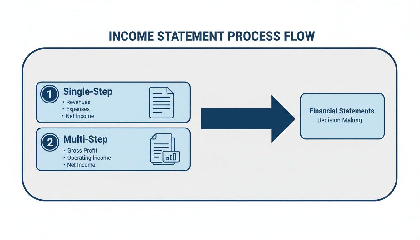
As you can see, the multi-step format gives you that critical Gross Profit checkpoint. This offers a much deeper insight into your core operations before you even start factoring in overhead.
Grouping Your Revenue Streams
Every income statement starts with Revenue, but just plopping a single total at the top is a huge missed opportunity. For any service business, the real power comes from breaking down that revenue into distinct categories. This immediately shows you where the money is coming from.
A digital marketing agency, for example, might group its revenue this way:
- SEO Services Revenue: All income from search engine optimization projects.
- PPC Management Revenue: Fees earned from managing pay-per-click ad campaigns.
- Web Development Revenue: Money brought in from building client websites.
This simple grouping gives you a high-level view of which service lines are your heavy hitters. It’s the first step toward knowing what’s truly driving your growth.
Defining Cost of Services Sold
This is where so many service businesses get it wrong, and it’s arguably the most important section to nail. Cost of Services Sold (COSS), sometimes called Cost of Revenue, includes every direct cost tied to delivering your services. If you misclassify these costs, your profitability numbers will be completely skewed.
Here’s a simple rule of thumb: If a cost goes away when a specific client project ends, it’s almost definitely COSS. If the cost sticks around, it’s probably an operating expense.
Common examples of COSS in a service business include:
- Direct Labor: Salaries and wages for the people doing the client work (your consultants, designers, developers, etc.).
- Contractor Payments: What you pay freelancers or subcontractors brought in for a specific project.
- Project-Specific Software: Licenses or subscriptions used exclusively for one client’s work.
- Direct Project Materials: Any physical or digital assets purchased just to complete a client engagement.
Getting this right isn’t optional—it’s fundamental to understanding your actual performance.
Calculating Your Gross Profit
Once you have your revenue and COSS totals, you can calculate your first major subtotal: Gross Profit. The formula couldn’t be simpler: Total Revenue – Cost of Services Sold = Gross Profit. This number shows the profit your business makes purely from selling its services, before any overhead costs are considered.
From there, you can find your Gross Profit Margin (Gross Profit / Total Revenue), one of the most vital health metrics for a service business. It tells you exactly how efficient you are at delivering your services. A strong margin means your pricing is solid and you have a good handle on your delivery costs.
Organizing Operating Expenses
After Gross Profit, it’s time to list your Operating Expenses (OpEx). These are all the costs of keeping the lights on that aren’t directly tied to a client project. To make this section useful, don’t just create a long, messy list. Group them into logical buckets.
Common OpEx categories look something like this:
- Sales & Marketing: Ad spend, sales commissions, marketing software, and salaries for your sales team.
- General & Administrative (G&A): Office rent, utilities, insurance, legal fees, and salaries for administrative staff.
- Research & Development (R&D): Any costs you incur developing new services or internal tools.
This structure helps you immediately spot where your overhead is concentrated, making it much easier to manage budgets and find potential savings. If you need a refresher on setting up these accounts, check out our detailed guide on creating a well-structured Chart of Accounts.
Finding Operating Income and EBITDA
With your OpEx organized, you can calculate another key subtotal: Operating Income. This is your Gross Profit – Total Operating Expenses = Operating Income. This figure is powerful because it shows you how profitable your core business operations are, stripping out any noise from things like interest payments or taxes.
Many investors and analysts also want to see EBITDA (Earnings Before Interest, Taxes, Depreciation, and Amortization). To get it, just take your Operating Income and add back any depreciation and amortization. EBITDA is often seen as a proxy for cash flow because it removes non-cash expenses. Showing both Operating Income and EBITDA gives a more complete picture of your company’s efficiency and earning potential.
Designing Columns for Maximum Analytical Power

A well-structured multi-step income statement gives you a clean look at your profitability, but the real magic happens when you start adding comparative columns. Think about it: a report for a single month tells you what happened, but a comparative report starts to explain why it happened and where you might be going next.
Designing your columns thoughtfully is how you transform a static, historical document into a dynamic tool for making strategic decisions.
Instead of just looking at one month in isolation, you can start asking much more powerful questions. Did we actually grow compared to last year? Are we on track with our budget? Is a sudden dip in profit a one-time fluke or the beginning of a troubling trend? The right columns provide the context you need to find those answers.
Current Period vs. Budget Analysis
One of the most effective column setups is a straightforward comparison of your actual results for the current period against the budget you set for that same period. This format instantly flags any variances, showing you exactly where you overperformed or fell short of your goals. It’s the ultimate accountability tool.
For instance, you might see that your Sales & Marketing expenses were 15% over budget. This immediately prompts a deeper dive. When you design your income statement, you can build in metrics that help you investigate, like how to measure marketing ROI to see if that extra spending actually generated a worthwhile return. Without this simple comparison, that 15% overage might have gone completely unnoticed.
This kind of analysis is crucial for a few reasons:
- Performance Measurement: You can see at a glance if departments are hitting their financial targets.
- Proactive Adjustments: It helps you spot budget variances early, so you can make corrections before they snowball into major problems.
- Future Planning: Over time, you can use historical variance data to create much more accurate and realistic budgets.
Period-Over-Period Trend Spotting
Another powerful format involves comparing your performance across different time frames. This is where you can truly start to spot trends and get a feel for the natural rhythm of your business.
Two common and incredibly useful comparisons are:
- Month-over-Month (MoM): This is perfect for spotting short-term trends and the immediate impact of your decisions. Did that new marketing campaign in April lead to a revenue spike in May? Is your direct labor cost slowly creeping up each month? MoM analysis gives you a real-time pulse on your operational efficiency.
- Year-over-Year (YoY): This comparison is ideal for identifying seasonality and measuring long-term growth. A consulting firm, for example, might notice that revenue always dips in December but peaks in March. Knowing this helps tremendously with cash flow planning and resource allocation for the year ahead.
A single data point is just a number; two data points create a line, showing direction. By adding comparative columns, you are drawing the lines that reveal your business’s trajectory.
The Power of Common-Size Analysis
Perhaps the most insightful column you can add is the ‘% of Revenue’ column. This simple calculation, also known as a common-size analysis, presents each line item as a percentage of your total revenue for that period.
This technique is a game-changer because it lets you benchmark your performance over time, regardless of whether your revenue is growing or shrinking.
Let’s say your rent expense goes up in pure dollar terms. That might seem concerning. But if it’s actually decreasing as a percentage of your revenue, that’s a positive sign of improving efficiency. This format helps you answer the critical question: “Are my costs growing in proportion to my revenue?” It’s a simple yet incredibly effective way to keep your financial structure in check as your business scales.
Common Formatting Mistakes to Avoid
Even with the best of intentions, a poorly formatted income statement can paint a dangerously misleading picture of your business’s health. Getting the numbers on the page is one thing; presenting them with clarity and consistency is another entirely. Overlooking a few key details can hide crucial insights and lead straight to flawed decisions.
One of the most common—and damaging—errors we see is the misclassification of costs. It’s tempting to lump expenses together, but this shortcut can completely warp your profitability metrics. You have to be meticulous about separating your direct costs from your general overhead.
Blurring Direct Costs with Overhead
Here’s a classic mistake: booking the salary of a billable consultant under “Salaries and Wages” right alongside your administrative assistant. While both are payroll expenses, they serve completely different purposes in your business. The consultant’s salary is a direct cost of delivering your service—it belongs in Cost of Services Sold (COSS), plain and simple.
When you misclassify it as a general operating expense, two huge problems pop up:
- Your Gross Profit gets artificially inflated. This makes your core services look way more profitable than they actually are.
- Your Operating Expenses look bloated. It gives the impression that your overhead is out of control when it might be perfectly fine.
This single error makes it impossible to accurately judge the profitability of your services, which in turn makes it impossible to price them strategically. The fix is a disciplined Chart of Accounts that clearly separates direct, service-delivery labor from administrative labor.
Creating an Overly Complex Chart of Accounts
Now, on the flip side of sloppy classification is getting too granular. A Chart of Accounts with hundreds of hyper-specific expense accounts might feel detailed, but it usually creates more noise than clarity. Do you really need separate accounts for “Blue Pens” and “Black Pens”? Probably not.
An overly cluttered Chart of Accounts makes your income statement a nightmare to read and analyze. It forces you to mentally add up dozens of tiny line items just to understand a broader category, like marketing.
The goal is to group related expenses into logical, high-level categories that provide meaningful insight. Aim for a structure that is detailed enough to be useful but simple enough to be understood at a glance.
For instance, just group all your software subscriptions under a single “Software & Subscriptions” account. You don’t need a new line item for every single tool you use.
Using Inconsistent Reporting Periods
Another critical formatting mistake is comparing inconsistent time periods without any context or adjustment. Pitting a four-week month against a five-week month, for example, makes trend analysis completely unreliable because you’re not comparing apples to apples. Any growth or decline you see could just be a quirk of the calendar, not a real change in business performance.
You have to ensure your comparative reports use consistent periods—monthly, quarterly, or annually. This discipline is essential for spotting genuine trends, understanding seasonality, and making reliable forecasts.
This need for standardized formatting isn’t just a small business issue; it happens on a global scale. Just look at the evolution of World Bank income classifications since 1987. Precise, consistent income aggregation—much like what we do on a business’s P&L—caused the share of high-income countries in Latin America and the Caribbean to jump from 9% to 44% by 2023. That’s the kind of detail-oriented formatting we at Steingard Financial apply to give our clients benchmark accuracy.
Putting It All Into Practice
So, where do we go from here? We’ve walked through the power of a multi-step format, the clarity of logical account groupings, and the insights you get from adding comparative columns. The theory is solid, but the real value comes when you actually implement it.
By applying these principles, you’re not just tidying up your books. You’re turning your income statement from a historical document—a look in the rearview mirror—into a powerful tool for looking ahead. It becomes the bedrock for setting realistic growth targets, dialing in your service pricing, and making confident operational moves backed by real data.
From Report to Roadmap
Think of this new format as your strategic compass. It points you toward what’s working and what isn’t. It shows you exactly which services are driving the most profit and highlights where your costs might be getting out of hand. This is the kind of visibility that lets you manage your business proactively instead of just reacting to problems as they pop up.
A properly formatted income statement stops being a summary of the past and becomes a detailed plan for the future. It’s where financial data turns into business intelligence.
Once your statement is ready, you’ll need to share or archive it, which often means creating a PDF. Knowing how to work with these files is a surprisingly useful skill. For instance, mastering PDF to Word conversions for financial reports can be a lifesaver when you need to pull data or add notes after the fact.
To see how this all fits into the bigger picture, our guide on how to prepare financial statements provides that broader context.
A Few Common Questions
Even with a step-by-step guide, you’re bound to have questions when you start digging into your own income statement. This is especially true for service businesses, since our financial DNA is just different from a company selling physical products.
Let’s tackle a few of the most common questions we hear from clients. Getting these details right is the key to creating a report that’s not just accurate, but genuinely useful for your specific business.
What’s the Biggest Difference Between a Service and Product Income Statement?
The short answer: the ‘Cost of Goods Sold’ (COGS) section. For a product company, COGS is pretty straightforward—it’s the tangible costs like raw materials and the labor to assemble the product.
For a service business, we call this ‘Cost of Revenue’ or ‘Cost of Services’. This is where you put all the direct costs of delivering what you sell. Think of things like:
- Salaries and wages for your billable team—the people doing the actual client work.
- Payments to the freelancers or subcontractors you bring in on projects.
- Software subscriptions you need specifically to do the work for a client.
Nailing this section is non-negotiable. It’s what allows you to calculate an accurate Gross Profit and see how profitable your core services truly are.
How Often Should I Be Looking at My Income Statement?
For a full, detailed review, a monthly rhythm is perfect. This is the cadence that lets you track how you’re doing against your budget, spot trends before they become problems, and make smart adjustments.
That said, you don’t have to wait a full month to have a pulse on your business. We often advise clients to do a quick weekly check-in on a few key metrics. Just a glance at high-level numbers like weekly revenue and direct labor costs can help you stay proactive instead of reactive.
“A monthly close gives you a clear picture, but a weekly check-in on key metrics gives you the agility to navigate the month successfully.”
Can I Actually Build This Format in QuickBooks Online?
Yes, you absolutely can. The reporting tools inside QuickBooks Online are more flexible than most people realize. You can customize the standard Profit and Loss report to create all the subtotals we’ve discussed, group accounts together, and add columns for month-over-month or budget-to-actual comparisons.
The real trick to making this easy? It all comes down to having a well-structured Chart of Accounts from day one. When your accounts are set up logically, the data just flows right into your custom report format. It saves a massive amount of manual work every single month.
A well-formatted income statement is your roadmap to financial clarity. At Steingard Financial, we specialize in setting up the systems and reports that give service business owners the confidence to make data-driven decisions. If you’re ready to transform your financial reporting from a chore into a strategic advantage, we’re here to help. Learn more about our bookkeeping and financial advisory services at https://www.steingardfinancial.com.