Your revenue report says the month was strong. Your team hit utilization targets. Cash came in. On paper, it looks fine.
Then someone asks a better question. What changed inside the total? Did higher-value advisory work make up more of the month, or did lower-margin cleanup projects take a bigger share? Did one office grow because it sold the right service mix, or because it discounted heavily and filled capacity with less profitable work?
That's where a 100 stacked bar chart earns its place in financial reporting. It doesn't help you prove that total revenue increased. It helps you show how the makeup of revenue, labor, client mix, or service delivery changed across teams, months, offices, or customer segments.
For service businesses, that distinction matters. Owners don't just need bigger totals. You need to see whether the business is shifting toward the kind of work that supports margins, staffing stability, and cleaner forecasting.
The Challenge of Comparing Business Performance
A common reporting problem shows up when a business owner reviews service line results across a few periods. One month has more bookkeeping revenue. Another has more payroll support. A third has less total revenue but better gross margin. The raw numbers answer one question and hide another.
If you only look at dollars, you can miss the story inside the business. A consulting team might post a larger top line while a lower-value service category takes up more of total production. An operations leader may see billable hours rising without noticing that a growing share comes from work that's harder to staff or harder to collect on.
That's why strong MIS and reporting systems don't stop at totals. They separate volume from composition, because those are different management questions.
A total tells you what happened. A mix view tells you why the result may or may not be repeatable.
In service businesses, that difference affects real decisions. You may decide whether to hire another senior consultant, push a specific package harder in sales, or tighten delivery around work that consumes time without supporting margin. A 100 stacked bar chart helps when the question is not “Which category is biggest in absolute terms?” but “How is each category made up relative to the whole?”
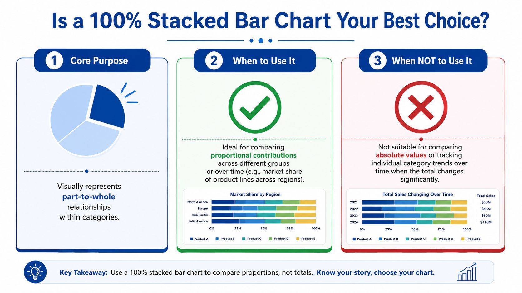
When a 100 Stacked Bar Chart Is Your Best Option
A 100 stacked bar chart is built for one job. It compares composition across categories, not raw size. In this format, every bar is normalized so each one equals 100%, which makes the segments useful for comparing proportional shares across groups rather than absolute totals, as the UK Office for National Statistics guidance on stacked bar charts explains.
For a service business, that's useful when you want to compare:
- Revenue mix by service line across locations or practice groups
- Labor mix between billable, admin, support, and rework time
- Client portfolio mix by industry, contract type, or retainer size band
- Survey response distribution across client segments or teams
What it does well
A standard bar chart answers, “Who sold more?”
A 100 stacked bar chart answers, “What made up each result?”
That makes it especially helpful in meetings where stakeholders keep jumping between categories with very different totals. Normalizing each bar removes the distraction of size and forces attention onto structure. If your tax practice, payroll team, and advisory team all have different total revenue, you can still compare how dependent each one is on a single offering or client type.
The format also works well when you need to discuss concentration risk. If one team gets a large share of its work from a narrow set of engagements, a normalized chart makes that pattern obvious fast.
What it doesn't do well
This chart is the wrong choice when totals matter most. If you need to show that one department produced more revenue or worked more hours than another, use a regular bar chart or a standard stacked bar. Once every bar is set to the same length, the underlying totals disappear unless you add them separately.
It also isn't the best answer when you want precise comparisons across many small segments. The more segments you add, the harder it becomes to read. The ONS guidance specifically recommends five or fewer segments for readability in stacked bars, which is a practical limit worth following in business reporting, especially for executive audiences.
Decision rule: Use a 100 stacked bar chart when your audience needs to compare shares. Don't use it when your audience needs to compare totals.
A quick comparison
| Chart type | Best question | Weak point in financial reporting |
|---|---|---|
| Standard bar chart | Which category is larger overall? | Doesn't show mix inside each total |
| Regular stacked bar chart | What are the total and the parts together? | Hard to compare proportions cleanly across groups |
| 100 stacked bar chart | How does composition differ across categories? | Hides absolute totals unless you add labels |
| Pie chart | What is one whole made of? | Poor for comparing multiple groups side by side |
Pie charts are often the first instinct for “part-to-whole” reporting, but they break down quickly when you need to compare several groups. A row of pies forces the reader to estimate angles. A 100 stacked bar chart gives you a shared linear scale, which is far easier to scan in a board deck or monthly review.
How to Prepare Your Data for a Perfect Chart
Most chart problems begin before the chart exists. The issue usually isn't Excel, Google Sheets, or Power BI. The issue is the data structure.
A stacked bar chart typically works best when your data is arranged in three or more columns, with the first column holding the main category and each additional column representing a segment, as described in Atlassian's stacked bar chart guide. For business users, that means your table should already look like a report before you insert the chart.
Start with the business question
Don't begin with software. Begin with one sentence:
- Are you comparing service mix by quarter?
- Are you comparing hours mix by team?
- Are you comparing client type mix by office?
That sentence tells you what belongs in the first column and what belongs in the segment columns.
What messy data looks like
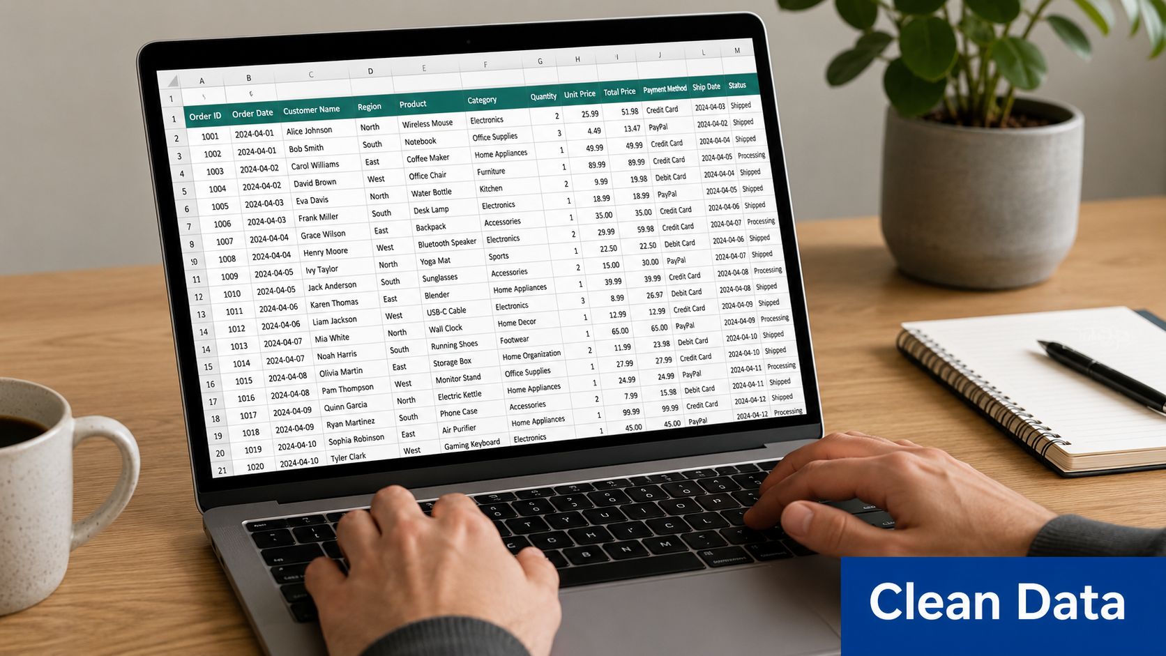
Many exports from QuickBooks, payroll systems, or project tools come out in a long transactional list. You may have rows like this:
| Period | Team | Service line | Amount |
|---|---|---|---|
| Q1 | Advisory | CFO support | value |
| Q1 | Advisory | Bookkeeping cleanup | value |
| Q1 | Advisory | Payroll support | value |
That format is fine for analysis, but it's awkward for quick chart creation.
What chart-ready data looks like
You want a pivoted table like this:
| Period | CFO support | Bookkeeping cleanup | Payroll support |
|---|---|---|---|
| Q1 | value | value | value |
| Q2 | value | value | value |
| Q3 | value | value | value |
Once your data looks like that, most tools can create the chart cleanly.
Clean charting starts with one row per comparison group and one column per component.
A few practical rules help:
- Keep categories consistent: Don't let “Advisory” in one period become “Consulting” in another.
- Remove one-off noise: If tiny categories aren't important to the decision, combine them into “Other.”
- Use one unit only: Don't mix hours and dollars in the same chart input.
- Check row completeness: Each row should represent one whole before normalization.
If you want a quick visual walkthrough before building your own file, this video is a helpful starting point:
Why finance teams should care about prep
In financial reporting, poor structure creates false confidence. A chart may render without errors and still tell the wrong story because duplicate categories, inconsistent labels, or mixed time periods distort the shares. Good preparation doesn't feel glamorous, but it's what keeps a dashboard from turning into decoration.
Building Your Chart in Common Business Tools
You don't need advanced software to build a useful 100 stacked bar chart. You do need to know where each tool helps and where it can be misleading.
Excel
Excel is still the default reporting environment for many service businesses, especially when monthly close packages feed management decks or lender reports.
Basic workflow:
- Arrange the table correctly. Put your comparison category in the first column and each component in the columns to the right.
- Select the full table.
- Go to Insert and choose 100% Stacked Bar or 100% Stacked Column, depending on whether horizontal or vertical bars read better for your labels.
- Check the series order. Excel may stack categories in a sequence that doesn't match your intended story.
- Add data labels only for segments that can be read clearly.
- Add a separate total label if the audience also needs the underlying dollars or hours.
The main Excel risk is trusting the default output. Users have reported scale problems in 100% stacked bar charts where the value axis doesn't start at zero or defaults to an odd level, which can distort interpretation, as discussed in a Microsoft Answers thread on fixing the scale in a 100 stacked bar chart.
If you use Excel heavily for board reporting, it helps to treat chart review the same way you treat formula review. The visual should be audited, not assumed. That same discipline shows up in any reliable cash flow statement format in Excel, where presentation choices can change how decision-makers read the same underlying numbers.
Google Sheets
Google Sheets can produce a workable chart quickly, but it often takes more manual adjustment to make the output board-ready.
A simple approach:
- Highlight your prepared table.
- Insert a chart.
- Choose the stacked bar or stacked column family, then switch to the normalized version if available in your setup.
- Review labels, color order, and legend placement.
- Manually tune the axis and labels if the display looks compressed or incomplete.
Where Sheets gets frustrating is the finishing work. Teams often end up using workarounds to preserve readable totals or cleaner labels. That's manageable for internal use, but it's a reason many finance teams still polish charts elsewhere before a client or board presentation.
Power BI and Tableau
These tools are stronger when you want the chart connected to live reporting filters. They're especially useful if your service business reports by office, service line, manager, or customer cohort and you want the same visual to update across slices of the data.
A sensible build path looks like this:
- Build a dataset with one clear category field, one segment field, and one value field.
- Aggregate the data at the right level before visualizing.
- Choose a 100% stacked bar visual.
- Control the sort order intentionally. Alphabetical sorting often ruins the message.
- Use tooltips to show the underlying total if you don't want to clutter the chart face.
Power BI and Tableau are good at interactive context. They're less forgiving when your data model is messy. If segment values are duplicated through joins or blended incorrectly, the chart still looks polished while showing bad proportions.
In finance reporting, a polished wrong chart is more dangerous than an ugly right one.
Python for technical teams
If you work with a fractional CFO, analyst, or data-savvy controller, Python can give you more control than spreadsheet defaults. It's useful when you want to standardize colors, control labels, or append total values consistently across many recurring charts.
The general process is straightforward:
- Group data by category and segment
- Sum the values
- Divide each segment by its row total to normalize each bar
- Plot horizontal stacked bars using the percentage data
- Add totals at the end if needed
That extra control matters when you want consistency across a reporting package, especially if you're producing multiple charts from the same data model each month.
Tool choice by use case
| Tool | Best fit | Watch out for |
|---|---|---|
| Excel | Monthly reporting packs, fast ad hoc analysis | Axis defaults, label clutter |
| Google Sheets | Lightweight collaboration, quick drafts | Manual formatting work |
| Power BI | Interactive dashboards and filtered views | Data model errors hidden by clean visuals |
| Tableau | Presentation-quality exploratory reporting | Over-design if the business question is simple |
| Python | Repeatable custom reporting | Requires technical support |
For most service businesses, the right answer isn't the fanciest tool. It's the tool your team can maintain accurately every month.
Designing Charts That Tell a Clear Story
A technically correct chart can still fail in a management meeting. The problem is usually design, not data.
Financial stakeholders scan fast. They want to know what changed, whether it matters, and whether they should act. If your chart uses random colors, crowded labels, or inconsistent ordering, you force the audience to decode the visual before they can understand the business issue.
Make the chart readable first
The strongest design choice is usually restraint.
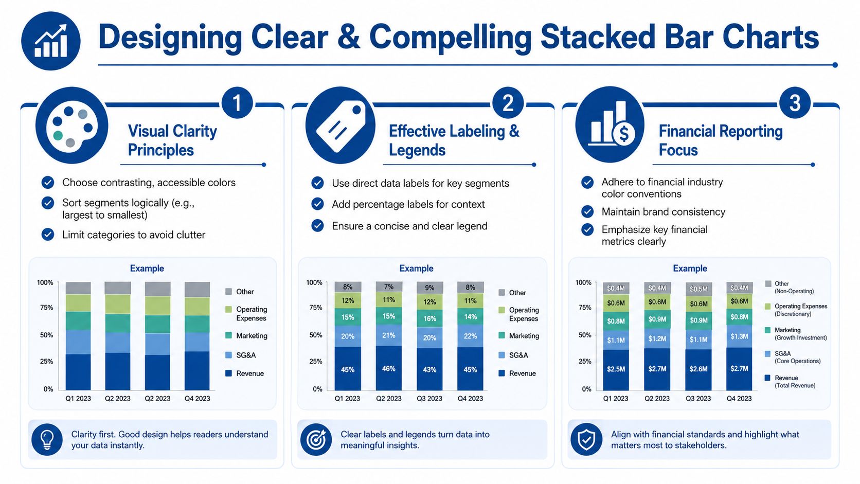
Start with these basics:
- Use a limited palette: If each segment represents a stable category, keep the same color mapping across every report.
- Sort categories intentionally: Chronological order works for periods. Business priority order may work better for departments or offices.
- Write direct titles: “Revenue mix by service line” is better than “Business performance overview.”
- Label selectively: Put labels on the segments people need to compare. Don't force every slice to carry text if it makes the chart noisy.
Use design to build trust
Finance charts aren't decoration. They're evidence.
When a reader sees consistent colors, sensible ordering, and plain labels, they relax and focus on the numbers. When they see rainbow palettes and tiny legends floating off to the side, they start wondering whether the reporting team understands the data.
That's why presentation standards matter. Strong business report formatting practices reduce cognitive load and make it easier for stakeholders to move from observation to decision.
Practical test: If a manager can't explain the main message of the chart in one sentence after a quick glance, the design needs work.
Match the chart to the meeting
A chart for an internal finance review doesn't need the same treatment as one for investors, lenders, or department heads.
For internal ops use, you may keep more labels and more categories because the audience already knows the business. For a board packet, simplify aggressively. Show the major segments, add the total elsewhere on the page, and write a title that states the point, not just the topic.
A few design choices usually pay off:
| Design choice | Why it helps |
|---|---|
| Consistent segment order | Makes cross-category comparison easier |
| Direct percentage labels on key segments | Reduces mental math |
| Clear legend with business language | Avoids decoding acronyms |
| Logical category sorting | Reveals pattern instead of hiding it |
The chart should support the decision you want the audience to make. If the issue is margin dilution, the visual should make the lower-margin share impossible to miss.
Avoiding Common Pitfalls and Misinterpretations
The 100 stacked bar chart is useful, but it's easy to misuse. Most of the trouble starts when someone asks it to answer a question it wasn't built to answer.
Expert commentary from Perceptual Edge on 100% stacked bars warns that this format is weak for time-series analysis and for reading many segment values because viewers have to do mental math to infer percentages and cumulative shares. That same guidance also aligns with a common finance-team frustration. Tools can introduce accuracy issues of their own if axes and scales aren't checked carefully.
The mistakes that show up most often
- Using too many segments: Once the chart gets crowded, only the largest segment is easy to compare.
- Treating it like a time trend chart: Long sequences of monthly bars are hard to read, especially when segment shifts are subtle.
- Hiding totals completely: A normalized chart can mislead if the audience assumes all bars represent similar volume.
- Trusting software defaults: If the axis, labels, or ordering are off, the chart can still look polished and be wrong.
What to do instead
For financial reporting, a few guardrails solve most problems:
- Keep the number of segments limited and combine immaterial items when appropriate.
- Add total values outside the bars if absolute scale matters to the decision.
- Use a different chart if the main discussion is trend over many periods.
- Review the value axis and category order every time the chart refreshes.
Some of the worst reporting errors happen when a normalized chart is shown without any total context. The audience sees composition and assumes scale.
A practical finance lens
This matters most in service businesses because mix shifts often drive staffing and profitability decisions. If one office appears to have the same service profile as another in a normalized chart, that doesn't mean the two offices generate similar dollars, hours, or contribution margin. It only means the internal proportions are similar.
That distinction is easy to lose in executive discussions. The fix is simple. Pair the 100 stacked bar chart with a nearby total, summary table, or headline metric so no one confuses composition with size.
Frequently Asked Questions
How is a 100 stacked bar chart different from a regular stacked bar chart
A regular stacked bar chart shows the total length of each bar based on the sum of its parts. A 100 stacked bar chart normalizes every bar to the same full length, so the focus shifts to relative share within each category. Use the regular version when total size matters. Use the 100 version when composition matters more.
Can I show absolute totals on a 100 stacked bar chart
Yes, but not by relying on the bar length itself. The cleaner approach is to add total labels at the end of each bar, place totals in a nearby table, or pair the chart with a headline metric above it. That keeps the composition view intact while giving stakeholders the scale they need.
What's the best way to handle very small segments
Group them into Other if they aren't decision-critical. Tiny slivers make labels unreadable and usually don't improve the story. In financial reviews, the audience rarely needs every minor category broken out unless one of them requires action.
Should I use this chart for monthly trends
Usually not for a long run of periods. It can work for a small number of comparison points, but once the series gets extended, the chart becomes harder to interpret. If the priority is trend over time, another format will usually read better.
Is horizontal or vertical better
Horizontal bars usually work better when category names are long, which is common in service businesses. Vertical columns can work when you have short labels and only a handful of categories. Pick the version that avoids cramped text first.
What should I include in the title
State the business question directly. “Revenue mix by service line” or “Labor mix by department” is stronger than a generic title. If the period matters, include it in the title or subtitle so the chart can stand on its own in a deck or exported PDF.
If you want your reporting to do more than summarize last month, Steingard Financial can help you build cleaner financial visibility. Their team supports service businesses with bookkeeping, payroll, reporting, and KPI-focused financial systems that make charts like these accurate, useful, and decision-ready.